

For small business owners, a newsletter signup form represents the critical threshold where a casual website visitor transforms into a committed subscriber. It functions as the primary portal for collecting essential contact information and channeling it directly into an email platform, enabling ongoing communication and relationship building. Yet, industry data and marketing analyses show that a vast majority of small enterprises deploy a rudimentary form on their websites and subsequently abandon it to gather dust.
According to recent marketing insights published by Sean Tinney on June 1, 2026, this passive approach carries hidden costs. Most traditional sign-up forms commit three fundamental errors: they demand excessive information upfront, communicate vague or uncompelling value propositions, and remain hidden in isolated sections of a website. Each of these missteps introduces an unnecessary barrier that routinely drives prospective subscribers away before they ever receive a brand’s introductory dispatch.
Addressing these friction points requires a strategic overhaul of form fields, placement strategies, copywriting techniques, and performance tracking mechanisms to ensure that digital real estate actively contributes to audience growth.
Fields That Belong on a Newsletter Signup Form
The foundational rule of form architecture dictates starting with the bare minimum: a single email address field paired with a clear subscribe button. Every additional input field integrated into a form introduces friction, and incremental friction directly depresses conversion rates. For the vast majority of small business newsletters, an email address remains the only mandatory piece of data required to deliver meaningful value.
When considering the addition of a first-name field, marketers must weigh its utility carefully. Personalization tags earn their keep only when an email service provider dynamically addresses recipients by name—transforming a generic greeting into a tailored salutation. While addressing a subscriber directly can lift open rates, this tactic fails if the underlying campaign content lacks personalization. Omitting the name field removes a potential point of friction, reducing the likelihood of abandonment.

Conversely, aggressive data collection practices—such as requiring phone numbers, corporate names, job titles, or physical addresses—frequently undermine small business outreach efforts. These extensive fields typically belong on lead capture mechanisms associated with gated white papers or direct sales inquiries. Deploying them on a general newsletter form signals to a visitor that the organization demands intensive personal data before offering any reciprocal value. If a business strategy cannot immediately utilize the specific data points gathered, those fields have no business appearing on the page.
Best Placement Strategies for Digital Visibility
Even the most thoughtfully engineered form will fail to expand an audience if prospective readers cannot find it. Strategic placement dictates visibility, and different locations across a digital property yield varying conversion potentials depending on a business’s unique model.
Homepage placement above the fold depends heavily on the core nature of the enterprise. For standalone digital publications where the newsletter constitutes the primary product itself, immediate above-the-fold visibility is essential because visitors arrive specifically to subscribe. For businesses where a newsletter serves a supporting role to a broader product or service line, prominent homepage forms still function effectively, provided they complement rather than overshadow the primary conversion goals.
Sidebar placements offer a reliable middle ground by remaining persistently visible as users navigate and read long-form content. Because visitors land on specific pages driven by topical interest, a sidebar form matching that theme keeps the option to subscribe within view without disrupting the reading experience. However, mobile device layouts frequently shift sidebars below primary content, necessitating complementary placement strategies for mobile-dominated traffic.
Dedicated landing pages provide an environment free from competing calls to action, giving brands ample room to articulate the comprehensive value of their email content. Business strategist Alexandra Franzen, who successfully scaled her readership entirely through email channels without relying on social media, famously characterizes her newsletter as an art project. Highlighting the ideal mindset during an industry webinar, Franzen noted that creators should aim to make their dispatches valuable enough that every reader actively recommends them to peers. Dedicated pages should sell this rich subscriber experience rather than treating the subscription as a mechanical transaction.
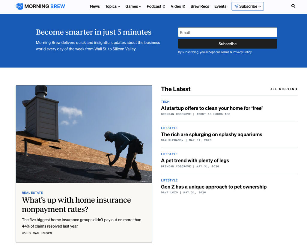
Header navigation bars and website footers capture users at different phases of the browsing journey. A persistent header form remains accessible across multiple pages for engaged readers exploring deep content archives. Meanwhile, footer forms act as a dependable safety net, catching visitors who have consumed an entire page and demonstrated genuine interest by scrolling to the very bottom.
Finally, exit-intent popups deploy intelligently when a cursor moves toward browser closing controls, serving as a final touchpoint before departure. To maintain user goodwill, these popups perform best when restricted to a single appearance per session, equipped with easily accessible close buttons, and anchored by specific messaging rather than generic prompts.
Copywriting That Converts Visitors Into Readers
Form copy relies heavily on three core drivers: the clarity of the promise, the transparency of the delivery schedule, and the reduction of perceived effort. Traditional phrasing such as "Subscribe to our newsletter" relies on mechanical instructions that fail to answer the fundamental question lingering in every visitor’s mind: what tangible benefit does this offer?
Benefit-driven language reframes the exchange by highlighting specific outcomes. Promising a weekly breakdown of targeted growth strategies answers multiple inquiries simultaneously—detailing the exact cadence, the specific topic, and the inherent relevance to the reader. This explicit clarity replaces guesswork with an immediate, informed decision.
Establishing frequency expectations directly on the signup form further safeguards audience retention. Transparency regarding whether dispatches arrive weekly, bi-weekly, or monthly aligns reader expectations with actual brand behavior, sharply reducing early unsubscribe spikes triggered by unexpected inbox clutter.

Call-to-action buttons represent the final psychological hurdle. Generic labels like "Submit" or vague prompts like "Learn more" foster ambiguity. High-performing button text mirrors the preceding benefit proposition—using phrases like "Get weekly strategies" or incorporating social proof such as "Join 1,200 readers"—to confirm the value of the impending click.
Transitioning From Rigid Templates to Intelligent Customization
Historically, digital marketing guidance encouraged businesses to adopt standardized form templates, swap in brand color palettes, and publish them with minimal alteration. However, these rigid frameworks inherently reflect generic layouts and assumptions that rarely match a brand’s distinct voice, frequency, or target demographic.
Addressing this customization gap, modern infrastructure incorporates advanced utilities such as AWeber’s AI Signup Form Builder. By analyzing a brand’s website content, tone, and specific audience parameters, generative tools can construct fully tailored sign-up mechanisms without requiring manual layout development from scratch. Marketers can embed these customized forms across websites, deploy them as dedicated landing pages, or integrate them as exit overlays, ensuring immediate synchronization with active subscriber lists.
Measuring Performance and Tracking Success
Deploying a form marks only the initial phase of audience development; ongoing performance analysis validates whether placement, copy, and structural choices achieve their intended benchmarks. Monitoring conversion rates across distinct placements reveals which site areas—such as high-traffic blog posts versus static footers—drive the majority of list growth.
Simultaneously, tracking early unsubscribe rates within the first thirty days provides critical diagnostic feedback. A spike in early departures frequently signals a disconnect between the expectations established by the form copy and the actual content delivered, allowing marketers to refine their messaging and maintain long-term subscriber engagement.