
By Sean Tinney
May 28, 2026
Your signup form serves as the single point of entry between a casual website visitor and your dedicated email list. In the landscape of digital marketing, this critical junction can entirely make or break a user’s decision to subscribe. Every element—ranging from the copy and overall design to the specific form type and its placement on a page—exerts a direct influence on whether a visitor decides to commit their email address or simply move on to something else.

Understanding what actually works, why those specific elements drive conversions, and how to apply these insights effectively remains a fundamental priority for content creators and business owners alike.
Types of Email Signup Forms
Different signup form types serve distinct strategic purposes across a website. Choosing the right option depends heavily on where and when a brand wants to capture a visitor’s fleeting attention.
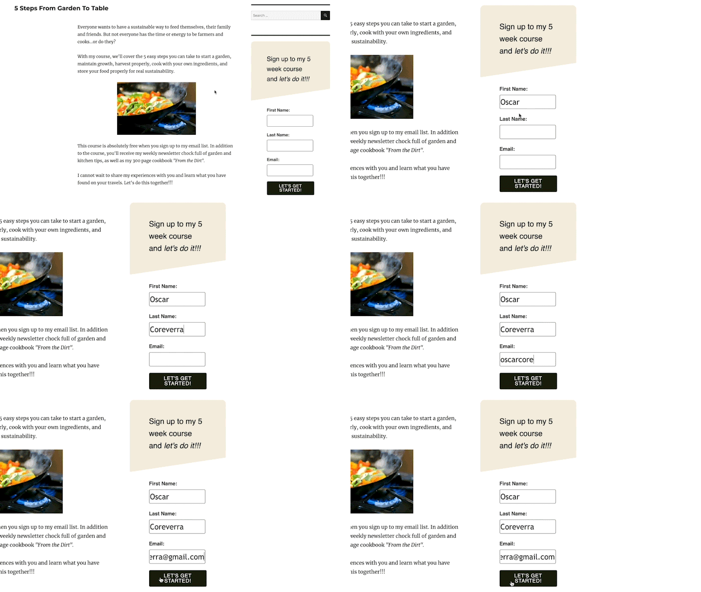
Inline signup forms are embedded directly within the body of a webpage. They can be positioned at the top, the bottom, inside a sidebar, or anywhere else within the natural flow of content. Publishers often deploy them across every page of a site or restrict them to specific, high-value articles. Using dedicated integration tools, such as the AWeber for WordPress plugin, allows publishers to quickly and easily embed these forms across various pages while tracking their overall performance.
Pop-up forms, by contrast, are not embedded statically within the content. Instead, they appear or "pop up" at targeted moments during a user’s browsing session. These forms might slide in from the side, drop down from the top, or rise from the bottom of the page, sometimes blurring the surrounding content or simply overlaying it. While pop-up forms reliably increase subscriber numbers because they immediately demand attention, they can occasionally impact the user experience if deployed too aggressively. Careful adjustment of display settings helps mitigate that disruption.
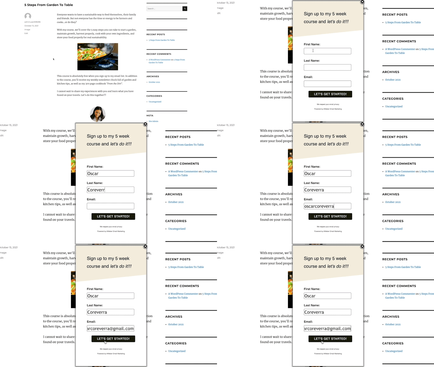
Four primary variations of pop-up forms dominate modern web design. Time-delayed pop-ups do not appear immediately upon arrival; instead, they allow visitors to first consume content before presenting the form. Analyzing web analytics to determine the average time a user spends on a page helps marketers set a delay just short of that threshold. Scroll-delayed pop-ups appear only after a visitor scrolls to a specific depth on the page, ensuring that the individual has already interacted with the material.
Exit-intent pop-ups trigger when a visitor demonstrates behavior indicating they are about to leave the site, serving as a powerful tool for recovering lost opportunities by presenting an enticing offer just in time. Finally, two-step pop-ups emerge only after a user explicitly clicks a link or button, frequently yielding high conversion rates because the visitor has already demonstrated proactive intent to receive the offer.
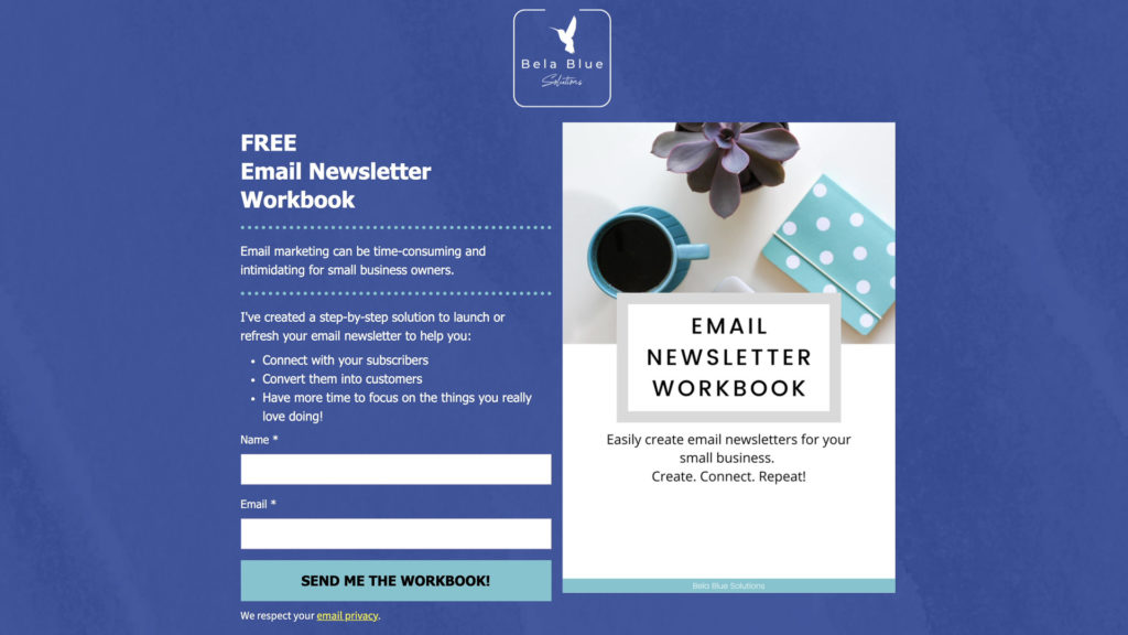
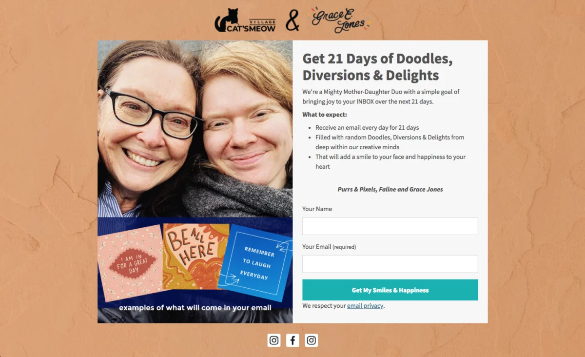
Landing page forms represent a third major category. Unlike traditional websites featuring complex navigation bars, menus, and multiple outbound links, a dedicated landing page has a single, unambiguous purpose: capturing subscriber signups. Visitors essentially face a binary choice: subscribe or leave. By stripping away distractions, landing pages keep visitors completely focused on the core value proposition, utilizing images, videos, and compelling text to emphasize what subscribers gain by joining.
Where Should You Place Your Email Signup Form?
Deploying a mix of form types ensures that a website caters to varying user behaviors. Some visitors interact immediately with a well-timed pop-up, while others respond far better to a traditional inline form embedded directly within an article.
When determining placement, publishers strive for spots that are highly noticeable yet completely natural, avoiding any jarring interruptions to the user experience. Keeping forms contextual—making them directly relevant to the specific content the visitor is currently consuming—dramatically increases the likelihood of conversion.
Inline forms belong on every single page of a website, typically residing within the footer or sidebar to ensure visitors always have a pathway to subscription no matter where they roam. The incentives attached to these universal forms usually feature broad appeal, such as a percentage-discount coupon or a digest of general best practices.

Pop-up forms, meanwhile, find their most effective home on high-traffic entry points like the homepage, where they can promote a brand’s primary incentive to the largest possible audience. Reviewing analytics tools helps identify other heavily trafficked pages where targeted, content-specific pop-ups can be introduced safely.
Writing Signup Form Copy That Converts
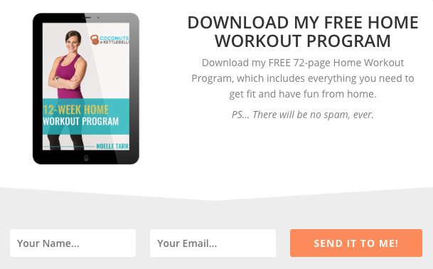
The text accompanying a signup form plays an essential role in communicating the value of an offer. Clear and concise headlines eliminate any ambiguity regarding what a subscriber will receive. For instance, fitness brands often use direct headlines advertising a comprehensive home workout program, accompanied by brief descriptions detailing the page count and fitness benefits.
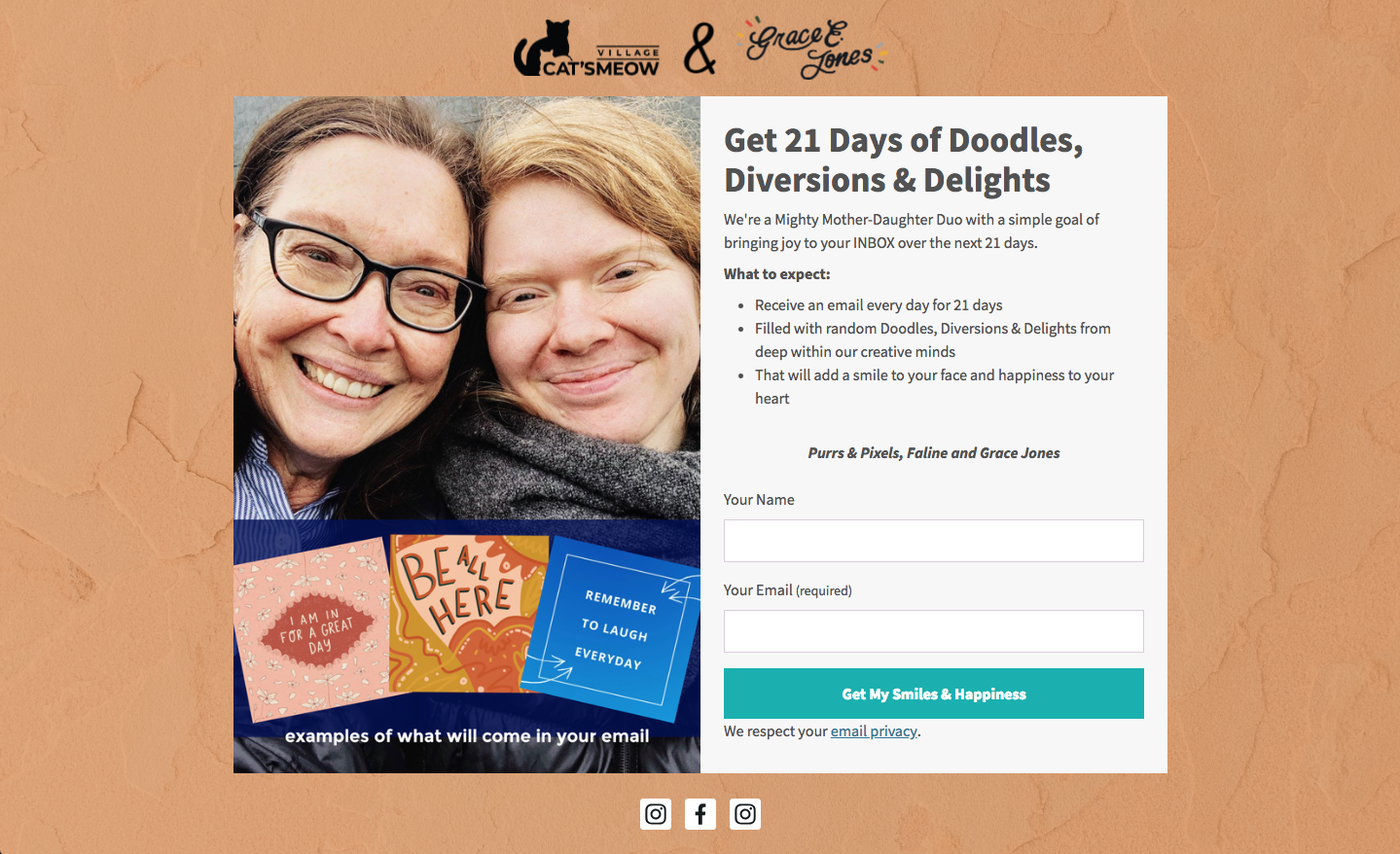
Beyond the headline, successful forms clearly articulate the underlying value proposition. Explaining how an offer solves a specific problem or answers a pressing question helps users visualize the tangible benefits of subscribing, whether through a brief narrative or a concise bulleted list of upcoming content themes. Setting clear expectations regarding email frequency and content type further reduces spam complaints and unsubscriptions while building long-term trust and maintaining regulatory compliance, such as adhering to GDPR guidelines.
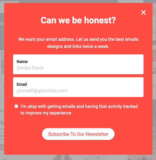
Incorporating conversational copy—such as casual greetings that catch visitors off guard—hooks readers by establishing a personal connection before introducing the core value of the list. Similarly, infusing humor, creativity, or witty branding terms into the copy and call-to-action buttons helps establish rapport and makes the entire subscription process feel engaging rather than transactional.
Designing for Maximum Conversion
Visual perception heavily dictates user behavior, with research indicating that the vast majority of first impressions rely entirely on visual and color cues. Keeping input fields to a minimum significantly reduces friction; asking only for a name and an email address allows visitors to complete the process swiftly. Additional details can always be gathered later through progressive profiling or post-signup surveys.
Call-to-action buttons should move far beyond generic labels like "Sign Up," instead employing urgent, personal, and possessive language that reinforces the specific action being taken—phrases like "Send me my free guide" or "Start my free trial." Typography also demands careful attention, utilizing a clear hierarchy where headlines stand out as the largest text, supported by distinct subheads and descriptions while sticking to a minimal palette of font types and colors.
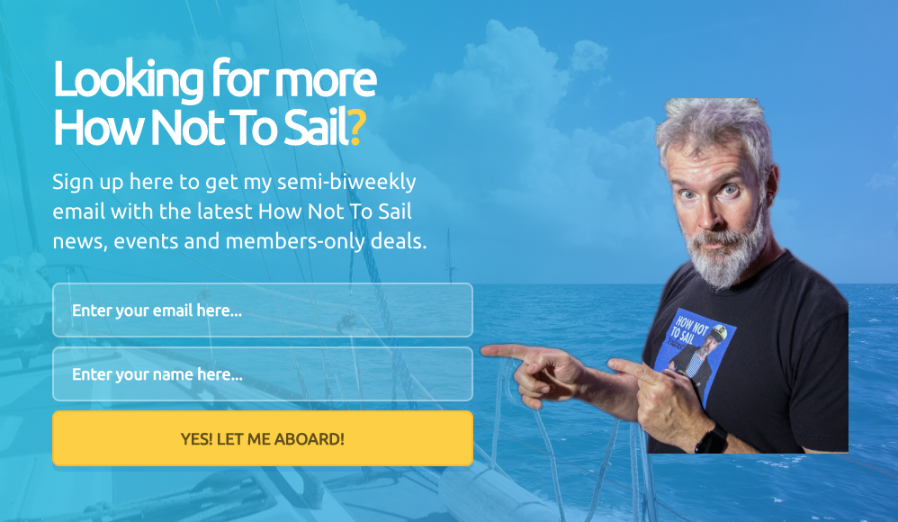
Creating robust color contrast helps forms pop against neutral page backgrounds, while visual representations of lead magnets, such as graphic mockups of downloadable guides, provide the extra persuasion needed to secure a conversion. Furthermore, allowing subscribers to choose their own content preferences fosters deeper personalization and long-term engagement.
Some brands even leverage unfavorable alternatives for dismissal buttons—such as offering a discount alongside a decline option that reads "No thanks, I prefer paying full price"—which subtly highlights the financial benefit of subscribing. Social proof, such as displaying the total count of existing subscribers, reinforces trust by demonstrating that thousands of others have already found value in the community. Finally, maintaining large touch targets for mobile users and generous white space around elements ensures the form remains clean, professional, and accessible across all devices.

Publishers looking to bypass manual design choices can also leverage modern tools like the AI signup form builder in AWeber, which generates complete, customized forms based on a brief text description of a business, automatically aligning brand colors, layouts, and copy while integrating directly with automated welcome workflows.
Testing and Optimizing Your Sign Up Form
Publishing an initial signup form marks only the beginning of the optimization journey. Because forms can experience fatigue as repeat visitors encounter them multiple times without converting, continuous testing remains vital. Marketers frequently run A/B split tests to compare competing versions of headlines, button text, or imagery to identify top performers and refresh their list-building strategy over time.
Real-world results underscore the power of thoughtful form optimization. When AWeber sought to revitalize its popular email marketing course, subscriber feedback revealed a split preference: some desired more frequent updates, while others preferred a slower pace. By updating the signup form to let new subscribers select their preferred course delivery frequency, the team witnessed a remarkable 47 percent increase in open rates and a staggering 150 percent lift in click-through rates.
Given that an overwhelming majority of small business owners author their own marketing materials, empowering subscribers with control over their experience demonstrates how minor, strategic adjustments to a signup form can yield monumental improvements in overall audience engagement.