
By Sean Tinney | June 16, 2026
In the modern digital marketplace, the psychology of color remains one of the most powerful and influential tools at a marketer’s disposal. Color possesses the immediate capacity to set a mood, evoke deep-seated emotions, and spark rapid psychological reactions that can either support or detract from the perceived value of an offering. Market research consistently underscores this visual dominance, revealing that an astonishing 90 percent of a subscriber’s first impression of an email message or a website is formed based on color and visual cues alone.
Understanding how colors impact marketing performance allows organizations to strategically design their digital ecosystems, including websites, landing pages, sign-up forms, and email campaigns. As consumer expectations shift and digital landscapes become increasingly competitive, the intentional use of color has transitioned from a purely aesthetic choice into a core component of effective communication and brand strategy.
How to Use the Psychology of Color in Marketing
To utilize color psychology effectively, marketers must first grasp its fundamental importance in consumer decision-making. Industry surveys indicate that roughly 84.7 percent of consumers consider color to be a critical factor when purchasing a product. Furthermore, strategic implementation of color can increase brand recognition by up to 80 percent, solidifying its role as a cornerstone of brand identity.
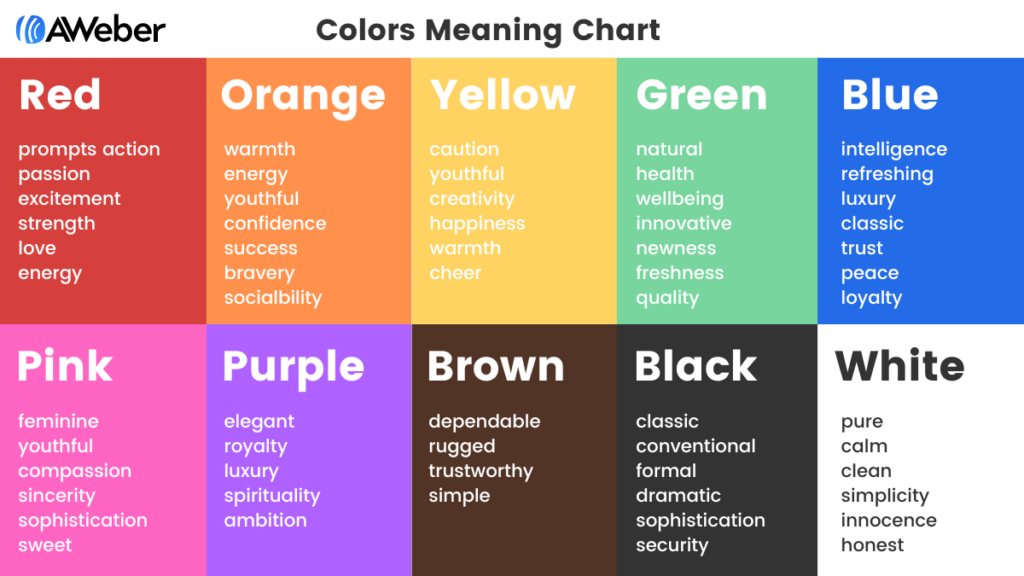
Extensive research also demonstrates a direct link between color application and how customers perceive a brand’s character and reliability. When individuals reflect on their favorite commercial enterprises, specific hues are almost invariably tied to those experiences. By examining established color meaning charts, brands can better understand how their visual presentation aligns with or diverges from public perception, enabling more deliberate choices in future marketing initiatives.
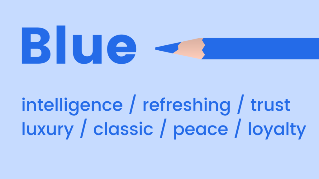
Different hues carry distinct evolutionary and psychological associations. Blue, for instance, is widely recognized for representing cool and calm feelings. This reaction stems from mood-boosting properties that signal the body to produce calming chemicals, promoting positivity. While light blue offers a refreshing splash of energy, dark blue serves as a classic choice for brands aiming to project luxury without the formal rigidity of black.
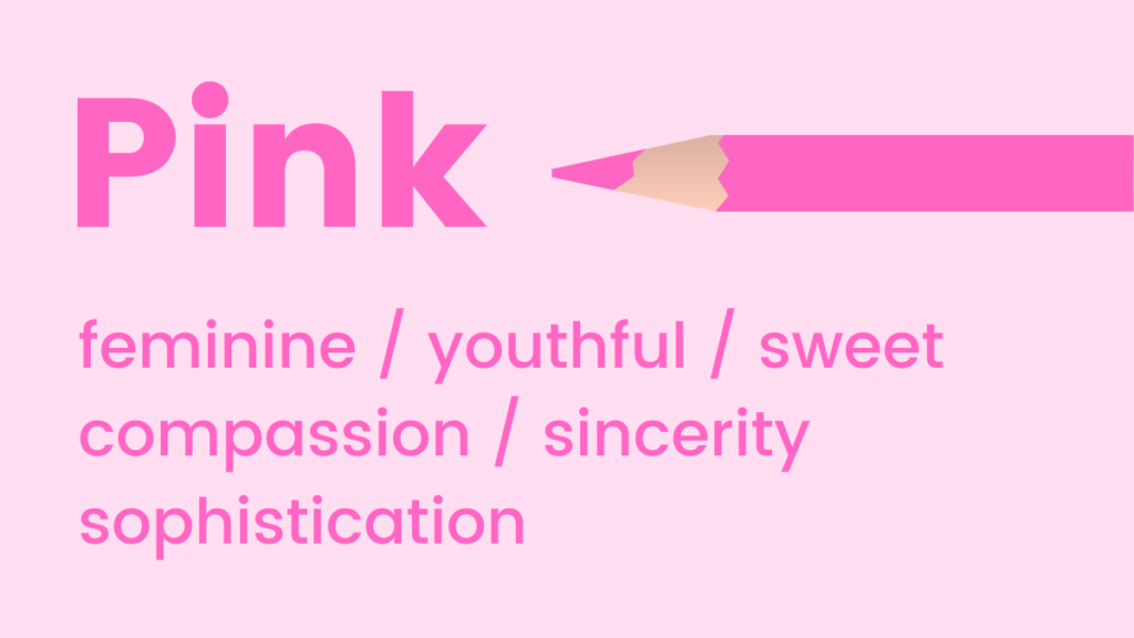
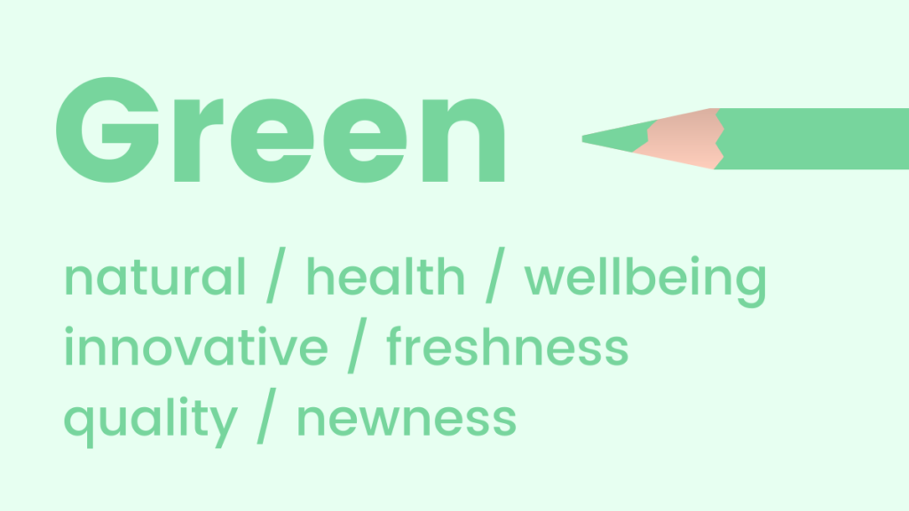
Pink tones lean toward the youthful, fun, and exciting end of the spectrum, making them ideal for emphasizing femininity or sweetness. Physiological studies suggest that pink can even stimulate a psychological craving for sugar. Green, by contrast, connects naturally with elements of health, nature, and well-being. It promotes relaxation and harmony, and because the human eye is exceptionally sensitive to green, allowing it to discern the widest array of shades, it functions as an ideal hue for announcing fresh products or newly launched features.
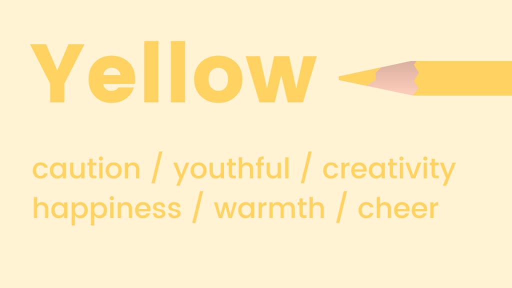
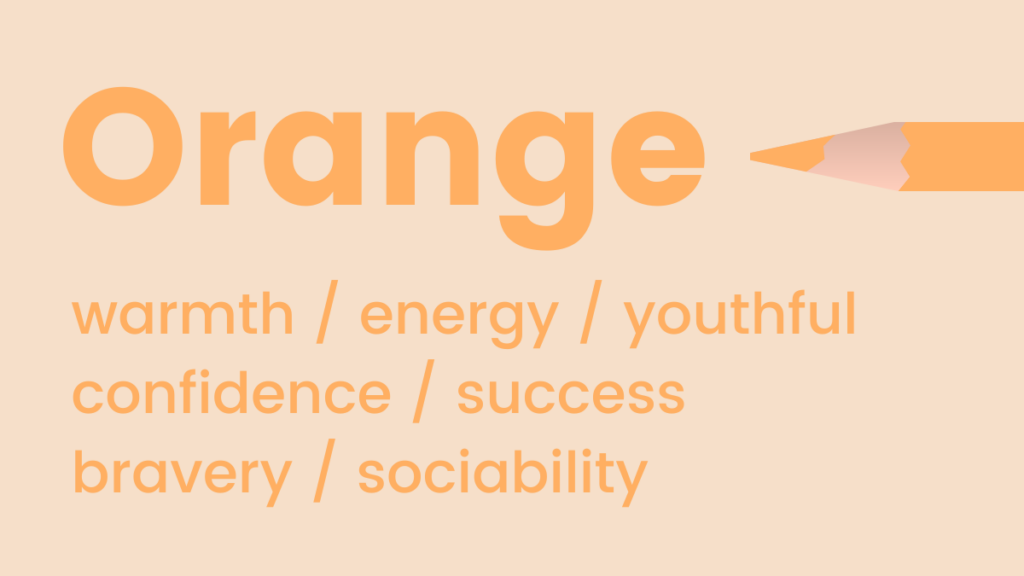
Orange bridges warmth and energy, conveying a flamboyant, positive, and optimistic attitude while paradoxically fostering a subconscious sense of trust and safety. Yellow shares similar optimistic qualities as the happiest shade on the color spectrum, known for activating memory, stimulating mental processes, and encouraging communication.
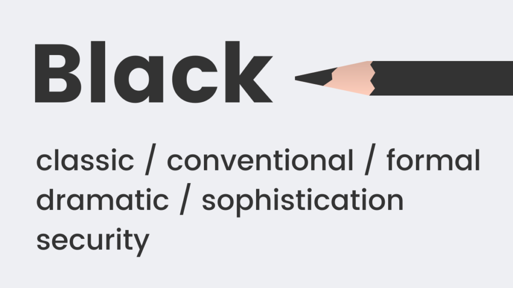
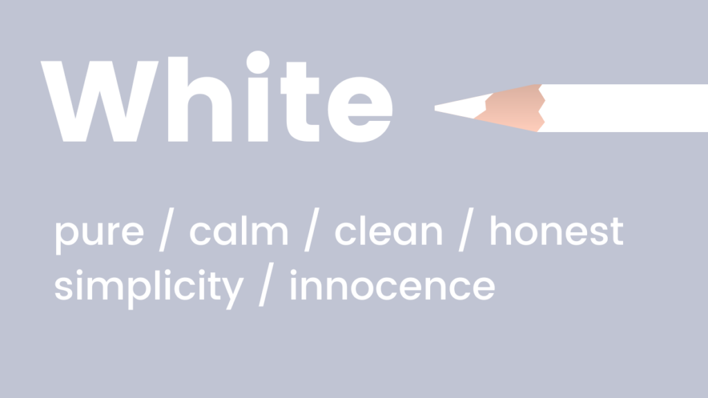
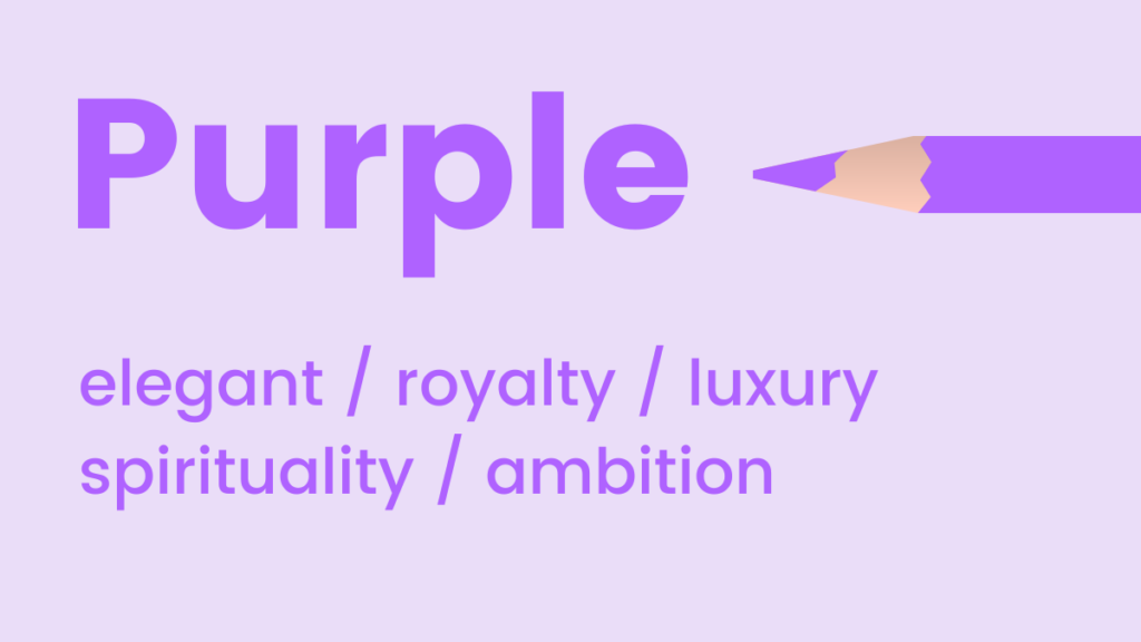
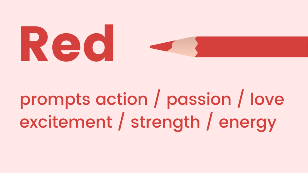
Traditional neutrals like black and white continue to carry heavy weight in design. Black represents classic formality and perceived physical weight, signaling sophistication and timeless style. White remains cool, calm, and serene, offering a modern and clean aesthetic. Purple occupies a unique space between vibrancy and calm, exuding luxury, elegance, and creative stimulation. Finally, red commands high-energy action, representing adrenaline and passion while driving urgency among consumers.
Choosing the Best Color Schemes for Websites and Landing Pages
Translating these psychological principles into cohesive website or landing page designs often presents a challenge for non-designers. Managing multiple colors without a foundational framework frequently leads to confusion, doubt, and poor visual combinations. However, understanding basic color relationships allows even design novices to build engaging layouts.
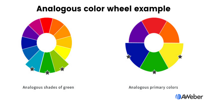
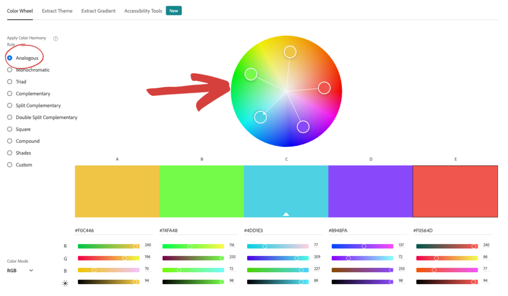
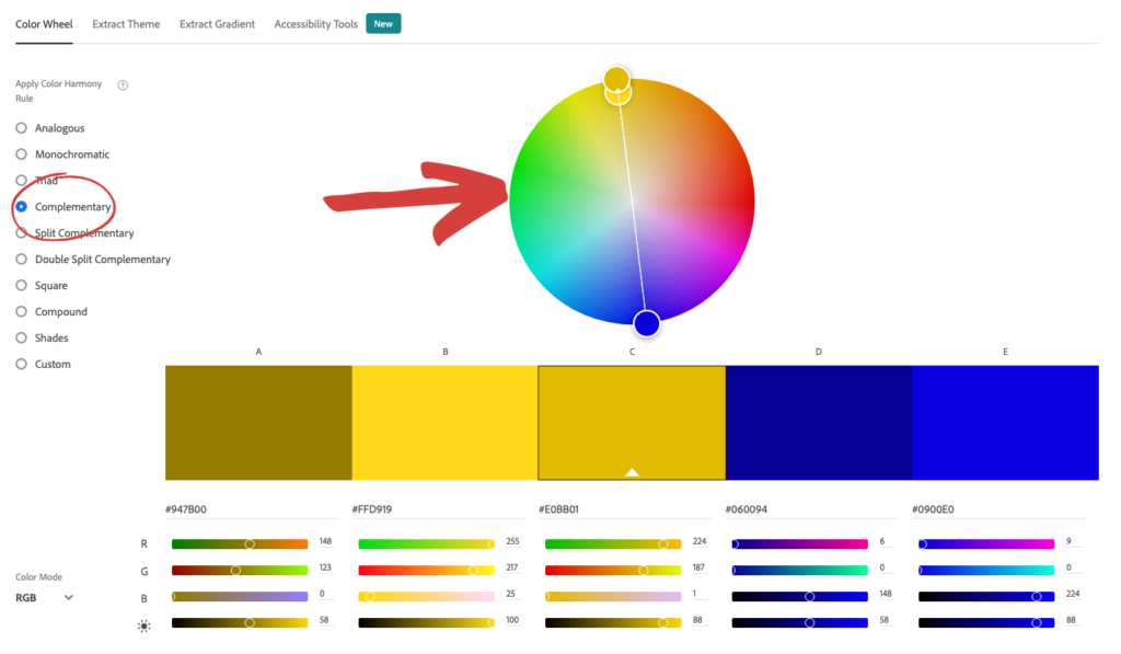
Among the various principles of color theory, analogous and complementary color schemes stand out as the most effective for digital design. Analogous colors sit adjacent to one another on the color wheel, such as blue, green, and yellow, or multiple variations of a single shade. This proximity simplifies the selection process, allowing creators to anchor their design with a preferred hue and easily identify supporting tones. Free industry tools like Adobe Color CC assist creators in isolating these combinations by adjusting color wheels digitally.
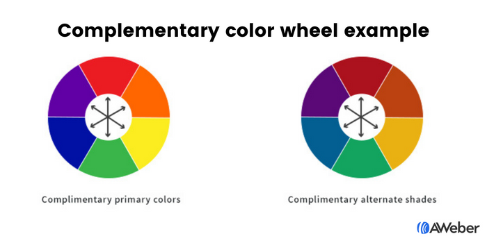
Complementary color arrangements offer a higher degree of visual interest and contrast by pairing hues positioned on opposite sides of the color wheel, such as blue and orange, green and red, or purple and yellow. These contrasting pairings create dynamic visual arrangements that naturally draw the eye, making them especially useful when moving away from standard primary colors.
Designing Effective Sign-up Forms Through Color Strategy
Sign-up forms require immediate visibility to achieve high conversion rates, and color plays a deciding role in whether site visitors notice them. Applying analogous, complementary, or contrasting strategies to forms ensures they stand out from surrounding content.
Analogous forms might utilize three progressive shades of green or a combination of yellow and green to maintain a harmonious flow. Complementary arrangements, such as purple and yellow or blue and orange pairings, naturally separate form fields and call-to-action buttons from the background.
Contrast remains one of the most reliable methods for directing user attention. By establishing a distinct contrast between the form and the surrounding website background, marketers naturally guide the viewer’s gaze toward the desired action area. Within the form itself, contrasting shades between input fields and submission buttons ensure that users immediately recognize the next step required to complete the interaction.
Tailoring Color Choices for Email Marketing Campaigns
The color palette of a marketing email should directly reflect its intended purpose. Email newsletters, which generally focus on delivering regular updates, informational text, or educational articles, benefit from clean white backgrounds accented by minimal brand colors. This prevents secondary design elements from distracting readers from the core content, reserving bold call-to-action colors strictly for links or buttons intended to drive engagement.

Welcome emails, serving as a primary introduction to a brand, perform best when utilizing established brand colors to reinforce visual identity. Sales emails adapt their color palettes according to the specific offer, drawing on foundational principles of color psychology to stimulate urgency, excitement, or trust.

Real-world campaigns illustrate these strategies in practice. Eyewear brand Warby Parker utilizes pale blue to evoke a refreshing vibe, while Everlane employs dark blue to project sophistication. Lyft relies on friendly pink tones within its onboarding sequences, and Offscreen leverages green palettes to promote relaxation and fresh product launches. Iconic brands like Lego lean into yellow to appeal to younger demographics, while Harry’s and The Little White Company utilize black and white respectively to communicate classic masculinity and pure serenity. Stuart Weitzman integrates its signature purple shoebox imagery into abandoned cart reminders to reinforce luxury and elegance.

Evolving Brand Colors and Modern Design Tools
Adapting an established brand aesthetic to incorporate new psychological color triggers can sometimes cause hesitation among business owners. However, brand identities are not static; just as individuals evolve over time, healthy brands grow and adapt. Introducing an auxiliary color outside traditional brand guidelines can often mark the beginning of a more effective chapter for a business. Online palette generators like Coolors assist marketers in integrating fresh shades that remain harmonious with existing brand assets.

Furthermore, technological advancements continue to streamline the design process. Emerging artificial intelligence tools, such as AWeber’s AI Signup Form Builder, allow marketers to generate custom sign-up forms simply by describing their desired look, feel, and vibe. By translating psychological color insights—such as the trust-building properties of blue or the urgent energy of red—directly into descriptive prompts, creators can bypass rigid templates and build highly targeted digital assets tailored specifically to their audiences.