
When users encounter an accordion menu on a website or mobile application, they face a deceptively simple interactive challenge: understanding how to expand and collapse hidden content. Designers often debate which visual indicators work best, weighing the merits of carets, chevrons, standard arrows, and geometric triangles. However, recent usability research provides clear empirical guidance on what works, what fails, and why certain common design patterns—such as split menus—actively harm the user experience.
Recent findings from the Nielsen Norman Group (NN/g) shed light on user behavior regarding accordion icons, revealing that seemingly minor visual details heavily influence user expectations, tap targets, and navigation flow. The study highlights that the caret remains the safest and most reliable icon choice, while custom indicators and overloaded symbols frequently introduce friction. Furthermore, the research underscores why separating text labels from icons to perform different actions creates a frustrating experience, and why simpler design patterns consistently outperform overly complex navigation schemes.
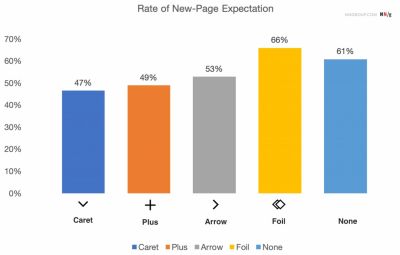
No Icon Equals Opening the Page
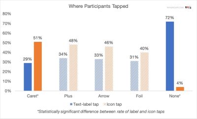
To understand how users interpret interactive elements, the research examined what happens when navigation items feature no icon at all. The findings confirm that without a visual indicator, users almost universally expect that tapping or clicking on a menu item will take them directly to a new page. When web designers implement custom or abstract icons, users frequently struggle because these graphics fail to communicate clearly that an accordion dropdown will appear.
Data from the study shows that users tend to tap with roughly equal frequency on both the icon and the adjacent text label for most standard icon types. This user behavior reveals a critical design implication: the choice of icon effectively dictates the behavior of the entire hit area, rather than merely serving as a passive visual signal.

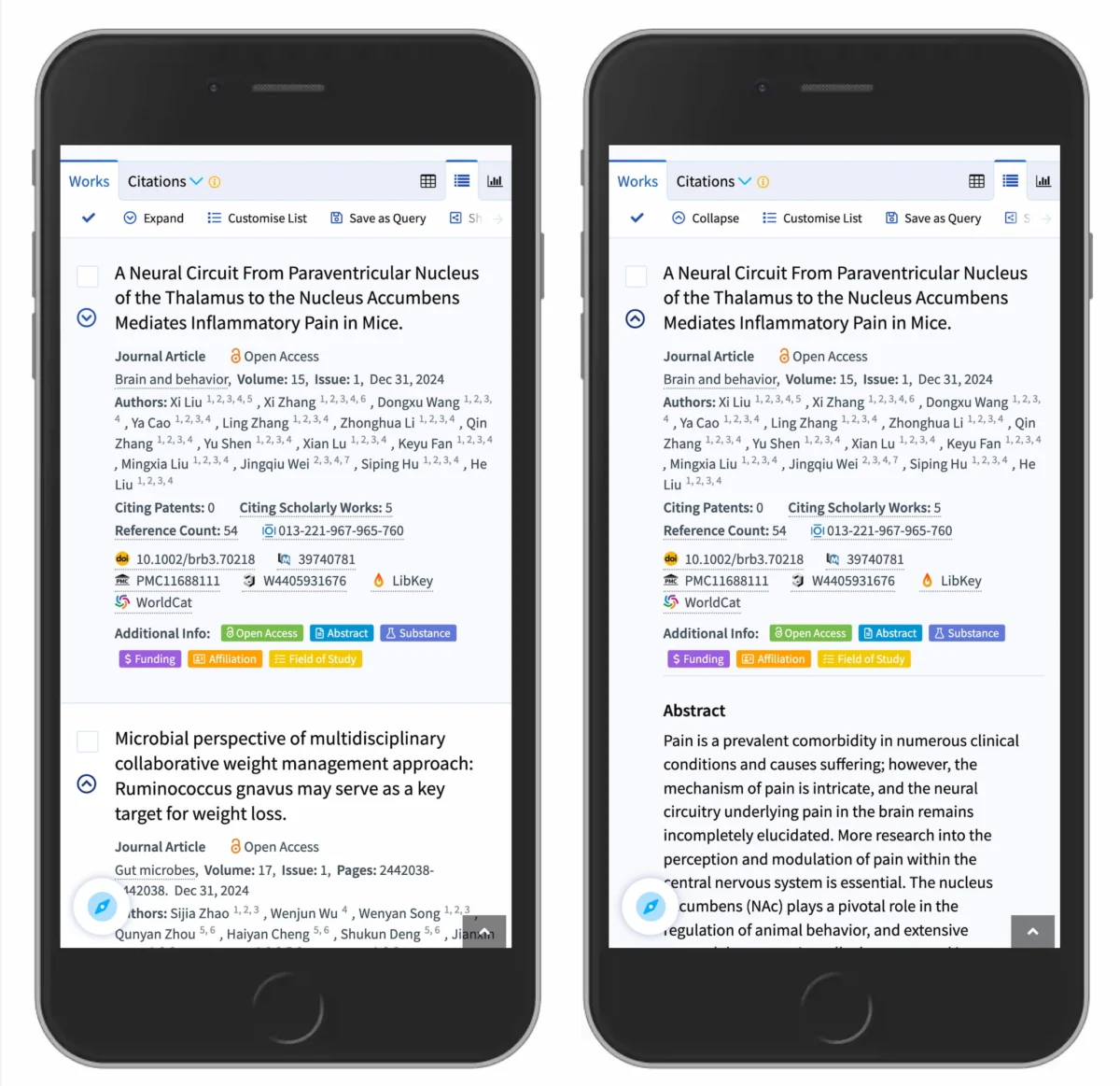
Many digital interface designs complicate this dynamic by introducing multiple arrows and carets that change orientation dynamically depending on the current state of the accordion. Yet, standard UX practices demonstrate that arrows are entirely unnecessary if a menu item simply links directly to a category page. According to the research, the most reliable and foolproof rule of thumb for standard text links is to underline them plainly, omitting arrows, carets, or auxiliary symbols entirely. While an underlined link may lack visual novelty, it communicates its function flawlessly across every demographic and device.
Confusing Behavior With Arrows and Split Buttons
Using a right-facing arrow icon does not reliably signal to users that they are about to navigate to a new page, just as using a downward-facing arrow does not universally imply that an accordion will open upon interaction. Because these symbols carry multiple meanings depending on context, relying on them alone can lead to user hesitation.
This ambiguity makes split buttons a particularly hazardous pattern for accordion menus. In a split button setup, the text label is programmed to link directly to a separate page, while the icon is designated to open the accordion drawer. Usability testing consistently shows that this pattern causes widespread user error and frustration. When users misjudge which part of the component they are interacting with, they end up landing on unexpected pages instead of expanding the menu, or vice versa.
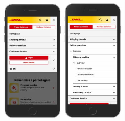
A more robust and user-tested approach avoids split buttons entirely. Instead of dividing the action between the label and the icon, successful interface design allows users to tap the main category container to expose the nested menu items. To provide access to the top-level category page itself, designers can include a dedicated link within the expanded menu, as demonstrated by organizations like DHL in their real-world e-commerce navigation implementations. This eliminates split actions and creates a predictable, unified interaction model.

Plus and Minus Signs Are Understood, But Can Be Misunderstood
Interface designers frequently turn to plus and minus symbols, as well as directional arrows, to signal expanded and collapsed states in collapsible content regions. While these symbols are widely recognized, they suffer from a significant drawback: they are heavily overloaded with alternative meanings across digital products.
A plus sign, for example, can signify a wide array of actions depending on the application context. It may indicate saving content for later, adding an item to a shopping cart, zooming in on an image or document, or creating a new entry. In complex, multi-level navigation structures where multiple tiers of menus remain open simultaneously, the ambiguity of the plus sign multiplies, leaving users uncertain about the hierarchy and state of the interface.
Similarly, directional arrows can suggest scrolling behaviors, sliding interactions, finding the next search match, or jumping to a specific anchor point within a long document. While plus-minus pairs and standard arrows are generally understood by web users, their multiple interpretations make them prone to misinterpretation in intricate layouts.
Wrapping Up
Interface design research points to a clear consensus for web and mobile developers seeking to optimize collapsible content. The safest and most dependable option for accordion menus is the downward-pointing caret or triangle by default, transitioning to an upward-pointing or sideways-facing caret upon user interaction. When carets are not feasible, plus and minus symbols generally serve as viable alternatives provided they are used consistently.
At the same time, modern interface design benefits from restraint. Websites and applications do not require extraneous icons or decorative arrows to indicate destination links. Split menus should be avoided because they generate more user errors than assistance. Instead, designers should rely on single, cohesive components where a primary action exposes available options, allowing users to drill down naturally. When a direct page link is required, underlining the title remains the most effective method. In digital design, as these findings demonstrate, simpler approaches almost always yield superior user experiences.