

Despite achieving robust, mainstream browser support that now hovers near 94%, CSS container queries remain surprisingly underused and frequently misunderstood across the web development industry. Years after their initial release, developers continue to grapple with how these modern layout tools differ from traditional media queries, when to reach for each approach, and how container queries fundamentally alter the way reusable components respond to the physical contexts in which they appear.
When CSS container queries first shipped, many developers missed the initial rollout entirely. Upon discovering the feature, a common first reaction was one of skepticism: why introduce a completely new layout mechanism when media queries have reliably handled responsive design for decades? While hindsight reveals the limitations of that initial resistance, industry data shows that hesitation was shared by legions of developers worldwide.
According to recent metrics from the State of CSS survey, approximately 86% of developers are fully aware that container queries exist, yet only 41.4% actively use them in production environments. During a presentation at SmashingConf Amsterdam, front-end educator Kevin Powell noted that overall adoption rates for container queries have been remarkably poor. This sluggish uptake remains puzzling, given that the ability for individual components to adapt fluidly to the size of their outer containers has ranked at the top of developer wishlists for years.
The core issue is not necessarily how many developers are using container queries, but how they are using them. Observation of early implementations reveals a widespread tendency to apply them incorrectly. This misuse stems from a deceptive visual similarity: at first glance, container queries look almost identical to media queries. Because they share a similar syntax, it is easy to assume they serve the same purposes and operate under the same fundamental rules. They do not.
To understand the distinction, it helps to narrow the focus to container size queries—a technique designed to respond to the physical dimensions of a particular container. While container style queries, which respond to computed styles, remain largely experimental, size queries offer an immediate paradigm shift. For the history of modern web design, the viewport has served as a reliable proxy. Media queries fostered the illusion that screen width alone dictates how a responsive application should adapt to its environment.
When writing a traditional media query, developers typically ask the browser a single question: How wide is the viewport right now? Media queries answer that question efficiently. However, complications arise when a component, such as a card widget, is placed inside a grid cell that measures only 300 pixels wide on a sprawling 1920-pixel desktop monitor. The media query remains indifferent to the component’s immediate surroundings. Because the viewport width easily satisfies a condition like a minimum width of 1024 pixels, the designated styles fire, forcing a complex layout into a cramped 300-pixel space. The result is often text overflow, squashed elements, and broken designs.
As Kevin Powell has observed, media queries are fundamentally limited not by their concept, but by their lack of contextual awareness. They simply do not know very much about the actual environment where components live. Traditional responsive design has long trained developers to think in terms of macro layouts—updating entire page structures, such as transitioning a multi-column desktop view into a single-column mobile view.
Container queries shift that perspective entirely by looking inward. They make responsive layouts reliant on what is happening inside a component, rather than forcing components to react to an outer context that has no insight into their contents. Instead of asking how wide the screen is, a container query asks how much space is available in a specific spot at that exact moment. By registering a parent wrapper with a container name and type, a card component can check whether its parent has achieved a specific inline width, such as 450 pixels, before shifting its display properties. The component no longer cares about the device viewport; it cares only about its immediate container.

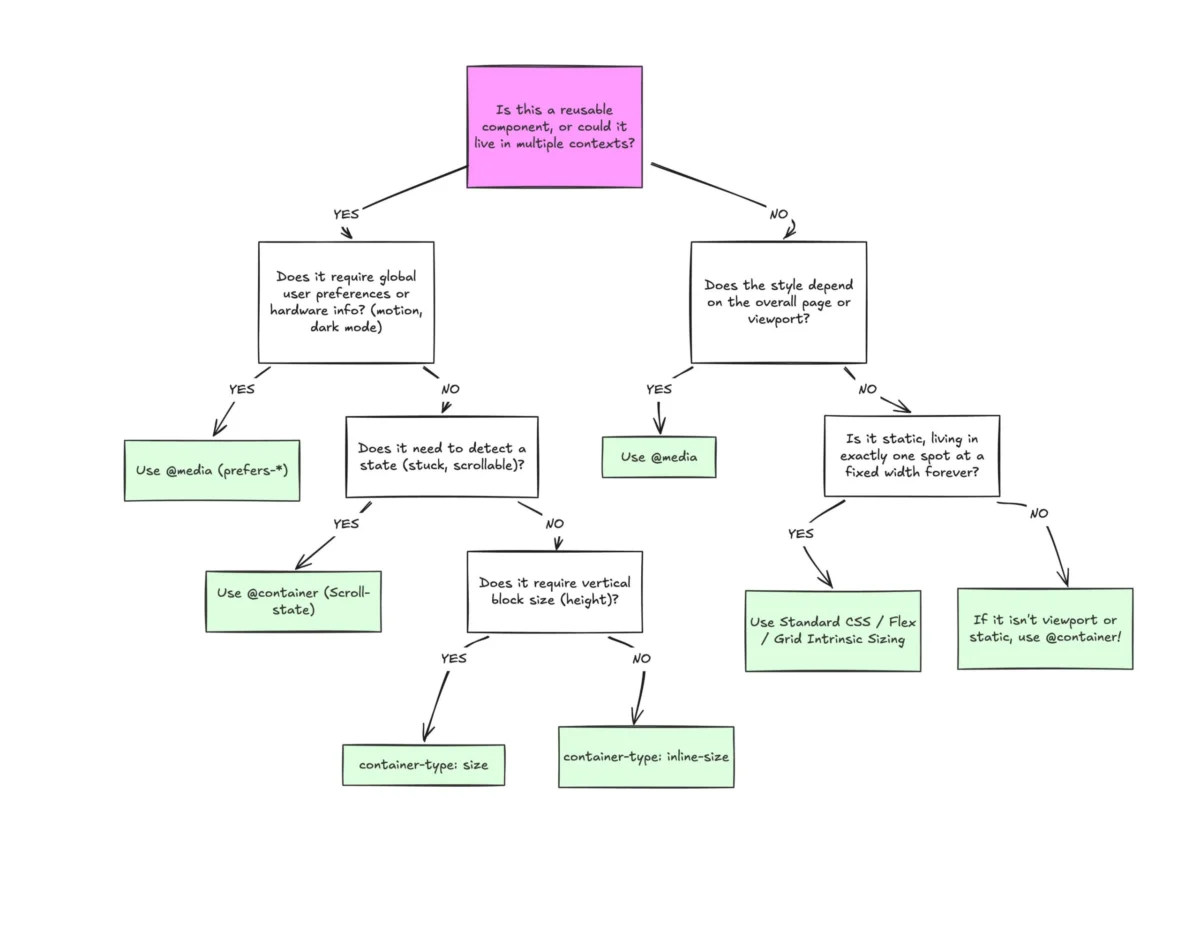
This establishes a clear boundary between macro layouts and micro layouts. Media queries remain ideal for macro layouts that govern overarching page structure, global headers, footers, and system preferences like color schemes or touch capabilities. Container queries are built for micro layouts—the self-contained components like cards, widgets, forms, and navigation bars that populate the macro layout. Rather than forcing an element to become tablet-sized simply because a viewport crosses an arbitrary threshold like 768 pixels, container queries allow components to switch layouts precisely when they have been allocated enough space to do so, regardless of whether that happens on a mobile screen or inside a narrow desktop sidebar.
The modern web features thousands of unique viewport sizes, rendering rigid breakpoint strategies increasingly difficult to maintain. By shifting layout logic closer to the container rather than the viewport, developers rely on the content itself to determine layout behavior.
This shift extends directly into typography. Responsive typography has traditionally relied on viewport-relative units like vw or vh within media queries to scale font sizes based on screen dimensions. While effective at the page level, scaling typography relative to the viewport causes issues when a component is relocated to a sidebar where the viewport size is completely irrelevant. Container queries introduce dedicated relative units, such as cqi and cqw, which can be combined with CSS clamp functions. This allows fluid typography to scale directly with the component’s container rather than the browser window, keeping the entire typographic scale self-contained.
Container queries also offer innovative ways to detect internal layout states, such as flexbox wrapping, which media queries cannot observe. Because media queries only monitor the external browser window, they are structurally blind to internal layout events, such as flex items wrapping onto a new line. Traditionally, detecting a wrap required JavaScript solutions like ResizeObserver. However, by nesting container queries inside flex items and allowing them to grow to fill available space, developers can build pure CSS workarounds. As parent containers shrink and cards wrap onto new lines, the items expand, triggering the container query to apply the appropriate styles dynamically.

Despite their power, container queries introduce specific side effects and technical caveats that require careful consideration. A container cannot query its own dimensions; attempting to name an element as a container and immediately query its own size creates an infinite loop. Instead, developers must establish a distinct parent-child wrapper relationship, applying the container logic to an outer wrapper while styling the inner descendant.
Furthermore, querying a container’s block size—its vertical dimension—without an explicit height, minimum height, or aspect ratio can cause the layout to collapse to zero pixels, as browsers calculate container dimensions independently of their children. Consequently, developers frequently rely on inline-size queries for horizontal dimensions unless vertical size queries are strictly necessary. Additionally, container queries currently cannot accept CSS custom properties directly within their conditions, as cascading custom variables create potential circular dependency risks during layout calculation.
Ultimately, container queries do not render media queries obsolete. Both systems serve distinct purposes within a modern architecture. Media queries remain essential for page-level structures and global viewports, while container queries excel at managing reusable components that exist across multiple layout contexts. Recognizing this distinction allows developers to build more resilient, context-aware web applications without relying on rigid assumptions about screen size.