
When a branding project encounters friction or ultimate failure, the breakdown rarely occurs during the final logo-crafting stage. Instead, the root of the problem almost always takes root much earlier, deep within the strategy phase. This is the critical juncture when well-intentioned teams rely on broad, ambiguous adjectives like "modern," "trustworthy," "premium," "friendly," and "disruptive" without ever defining what those terms actually mean in practice. The resulting disconnect creates a chasm between what a brand is implicitly expected to communicate and what a designer is tasked to produce.
This vital yet frequently overlooked interim space is what industry professionals call the "pre-concept" phase. At the launch of any brand identity initiative, designers are typically inundated with inputs: a creative brief, initial stakeholder conversations, competitor benchmarks, occasional moodboards, and a laundry list of abstract descriptors. From there, they are expected to conjure visual concepts that magically "feel right." However, judging whether a design is right becomes an exercise in guesswork when a team has failed to establish a shared consensus on what the brand must communicate in the first place.
Consider a recent engagement with a health technology company that stated they wanted their new identity to look modern, trustworthy, and disruptive. Initially, the term "disruptive" suggested a push toward something bold, unconventional, and visually loud. Yet, as strategic discussions deepened, it became glaringly obvious that their version of disruption still had to command absolute credibility within a deeply conservative healthcare ecosystem. Their primary clientele consisted of large government medical institutions; consequently, an aesthetic that felt overly rebellious, experimental, or aggressive would actively undermine the precise kind of institutional trust they needed to project.
Ultimately, their interpretation of being disruptive looked far more traditional than the literal definition implied. The underlying issue was never that the client chose incorrect language, but rather that the vocabulary was far too broad to serve as a reliable compass for design decisions. Before any designer can successfully translate high-level strategy into a tangible visual concept, those abstract terms must be rigorously refined. Teams must ask probing questions: What specific flavor of modern are we aiming for? In what exact way must the brand be trustworthy? Who are we disrupting, and how far can the visual system deviate from category expectations before the core audience feels alienated?
This foundational groundwork defines the pre-concept phase—the deliberate labor that unfolds immediately after project kickoff but well before the generation of the first visual directions. While the overarching brand identity process for digital products encompasses comprehensive strategy, concept exploration, implementation, and the creation of design assets necessary for digital product teams to build consistently, the pre-concept phase focuses strictly on the precursor work. It involves thoroughly researching brand context, unearthing hidden stakeholder assumptions, and forging a shared direction into a solid visual foundation. Rather than leaping straight into execution, it constructs a practical bridge between the meaning a brand must project and how its visual identity should begin to take shape.
The initial anchor point for building this strategic bridge is the brand workshop, an environment where broad discovery must be channeled into a precise comprehension of brand context.
Researching the Brand Context
A standard brand workshop naturally navigates traditional discovery topics: core business mechanics, overarching goals, specific products or services, the competitive landscape, and target demographics. Beyond these standard inquiries lies a smaller, highly strategic subset of questions that are remarkably easy to overlook yet invaluable prior to initiating visual work. These targeted inquiries transcend simple fact-finding; they are designed to clarify perception. They assist the collective team in grasping what exact beliefs the brand must instill in its audience, where it must maintain undeniable credibility, and which category conventions it should deliberately follow or challenge.
Perception sits at the absolute center of brand discovery because a brand ultimately takes shape within the mind of the observer. As branding pioneer Marty Neumeier famously observed in The Brand Gap, a brand is fundamentally a person’s gut feeling about a product, service, or company. Because the brand lives externally in consumer perception, the discovery workshop must explicitly clarify what specific perception the team intends to cultivate.

These perception-focused questions help expose the hidden assumptions underlying individual opinions rather than simply compounding the room with more subjective takes. The exact wording of these inquiries matters immensely because brand attributes frequently sound universally agreed upon until they are subjected to scrutiny. For instance, a stakeholder might declare that the brand needs to feel "premium," prompting universal nods of agreement across the table. In reality, however, one participant might envision a refined, editorial aesthetic; another might equate it with expensive, exclusive luxury; while a third might picture a clean, quiet, minimalist interface. Though the spoken word is identical, it harbors three entirely divergent visual systems.
Returning to the health tech initiative, the client’s desire for a "disruptive" identity could easily have steered designers toward loud, unconventional visual tropes. Because their target market consisted of risk-averse government medical institutions, true disruption had to be articulated through unmatched clarity, operational efficiency, and quiet confidence. Had the design team accepted the word at face value without contextual grounding, the resulting visual trajectory would have missed the mark entirely.
Similarly, a fintech team once requested an identity that felt "bold" without sacrificing institutional credibility. This particular objective generated productive tension. While boldness can easily translate into fluorescent colorways, oversized typography, and highly expressive graphics, a financial institution simultaneously demands rigorous signals of security, control, and competence. The central challenge was not deciding whether the brand should be bold, but rather determining what specific type of boldness would retain user trust.
When a team successfully defines these abstract attributes within their proper context, the designer is liberated from working with vague adjectives and can instead tackle a well-defined design problem.

While strategic questioning helps illuminate the verbal layer, words alone remain insufficient for steering visual execution. To successfully transition from language to imagery, teams benefit from integrating exercises that compel stakeholders to think through visual metaphors, associations, and relative perceptions. Echoing the sentiment behind GV’s popular Three-Hour Brand Sprint popularized by Jake Knapp, the primary objective of these collaborative exercises is to transform the abstract concept of "our company" into something concrete.
Participatory exercises are equally crucial for transforming stakeholders from passive observers into active contributors. When clients merely sit through a strategy presentation, they frequently remain passive, nodding along without recognizing the personal assumptions they bring to the table. Conversely, when forced to map out competitors, select targeted imagery, or articulate why a specific reference feels credible, their underlying attitudes, beliefs, and internal disagreements surface early, well before they possess the power to derail the initial concept review.
This alignment process typically begins by looking outward at the broader category before turning inward to examine the brand itself.
Competitor Perception Mapping and Visual Brand Drivers
Before convening the workshop, teams gather screenshots of competitor brands, websites, product interfaces, social media campaigns, and other visible touchpoints. During the workshop, stakeholders are prompted to position these competitors across a simple two-axis map. This exercise avoids subjective debates over whether a competitor’s design is objectively "good" or "bad"; instead, it reveals how the client perceives the category as a whole—identifying what appears credible, generic, overly conservative, or excessively experimental, while simultaneously highlighting open visual territory.

The underlying axes are intentionally selected to reflect the core tensions the brand must resolve. For a health tech enterprise balancing innovation with conservative clientele, the mapping framework might utilize axes ranging from traditional to progressive, and corporate to human. For a fintech venture aiming for distinction without alienating cautious users, the axes might span from understated to bold, and accessible to exclusive.
Crucially, the most valuable output of this exercise is rarely the completed map itself, but rather the productive friction and disagreements it generates. One stakeholder might categorize a specific competitor as progressive, while another views it identically as generic and dated. Another might read a brand as premium while a colleague perceives it as cold and sterile. Uncovering these discrepancies exposes how different individuals within the same organization define trust, innovation, and differentiation, resolving vital ambiguities prior to the commencement of design work.
Following category exploration, the focus turns inward through exercises like the Visual Brand Driver framework. Stakeholders are asked to select imagery across a diverse array of unrelated categories—including transport, typography, activities, furniture, moods, physical objects, animals, architecture, and beverages. Crucially, participants are instructed that their selections must represent the company rather than their personal aesthetic preferences.
For instance, if the company were a mode of transport, would it be a silent electric vehicle, a high-speed commuter train, a private jet, a bicycle, or a delivery van? If it were a piece of furniture, would it represent a soft lounge chair, a precise modular desk, or a heavy boardroom table? Following image selection, participants contribute four or five descriptive adjectives explaining their rationale. This analytical phase carries far more weight than the visual selection itself, as a single object can evoke vastly divergent interpretations. A train might signify speed, structured reliability, mass accessibility, or a rigid route, while a lounge chair might suggest calm comfort, informal flexibility, or a lack of urgency.

This methodology constructs a deeper layer of brand perception by relying on metaphor and association. Recurring patterns and contradictions quickly emerge, illuminating precisely what requires clarification before visual concept development can begin. Furthermore, this approach successfully separates brand identity from subjective personal taste, reinforcing the guiding question of whether an asset genuinely expresses the brand rather than simply satisfying a personal preference.
Translating Strategy into a Visual Foundation
Once discovery workshops have surfaced core assumptions, subsequent client meetings focus on translating shared understanding into a tangible visual foundation. This intermediary phase sits precisely between strategy and execution, allowing clients to react to perception boards, design principles, and early asset directions before designers invest valuable hours into full-scale concept creation.
This phase typically revolves around three interconnected layers: look and feel boards, design codes, and foundational brand assets.
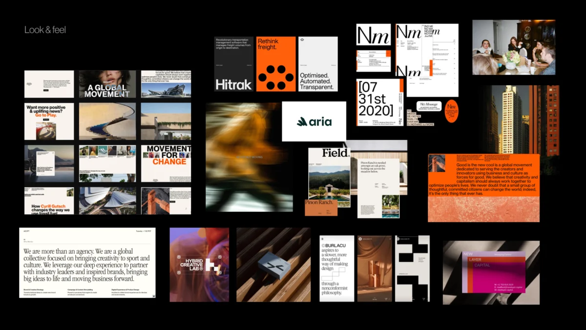
Look and feel boards intentionally avoid serving as mere repositories of inspiring visuals; instead, they function as perception boards. Designers curate references directly informed by workshop findings—incorporating desired perceptions, category tensions, competitor benchmarks, and core brand character traits. If an identity requires a balance of trustworthiness, modernity, and humanity, the compiled board facilitates a nuanced discussion regarding what specific manifestation of those qualities best suits the enterprise.

Building upon this, design codes make the overarching direction significantly more specific by translating foundational brand pillars into actionable visual principles. For a parenting platform, a core brand pillar such as personalized support for unique journeys might translate visually into organic shapes, handwritten lines, and soft compositions. Meanwhile, a pillar acknowledging that parenting is inherently messy and magical might manifest through soft gradients, layered imagery, and playful irregularities, while research-backed credibility is reinforced via data snapshots, editorial layouts, and clean infographics.
Similarly, for a prop-tech PR agency, strategic pillars denoting momentum and upward mobility can be visualized through dynamic lines, ripple effects, motion blur, and modular, stacked structural compositions. At this juncture, the team is not selecting final graphic elements, but rather validating whether the chosen visual metaphors resonate before active design commences.
The final layer addresses the core building blocks of identity: typography, color palettes, logo styling, photography, illustration, and graphic language. By evaluating early asset directions, the team establishes rigorous creative boundaries without prematurely locking in a predictable final identity.
Establishing Pre-Concept Readiness
Prior to greenlighting the creation of initial concepts, teams pause to verify whether they have achieved sufficient shared direction. This pre-concept checklist is not intended to pre-emptively dictate every creative decision, but rather to guarantee that designers are not launching into projects hampered by ambiguous terminology, hidden assumptions, or unresolved internal conflicts.

A robust pre-concept phase accomplishes more than simply handing designers a roadmap for exploration; it explicitly defines what directions must be avoided. By proactively identifying visual territories that would feel too expected, sterile, playful, conservative, loud, or generic, the team establishes clear guardrails.
When these boundaries are clearly articulated, subsequent design reviews transform fundamentally. Conversations shift away from subjective declarations of personal taste toward objective evaluations anchored in shared strategic goals. The dialogue evolves from simple assertions of liking or disliking a design to examining whether the proposed visual direction authentically expresses the agreed-upon brand identity.
Ultimately, the first design concept should never feel like a blind guess or an unexpected reveal. Instead, it should read as the natural, logical next step along a trajectory the entire team already understands and supports. While intuition, experimentation, and creative risk remain essential to exceptional branding, grounding them within a well-defined strategic problem empowers designers to push boundaries with absolute confidence. The pre-concept phase ensures that conversations surrounding brand identity remain meaningful, rigorous, and directly aligned with what the brand needs to become.