

The digital mental health landscape faces a stark and persistent operational crisis: user retention remains remarkably low. Data indicates that approximately 95% of users who open a mental health application on day one abandon it by day thirty, with the median 30-day retention resting at a meager 3.3%. Even the most widely recognized platforms in the sector lose roughly 50% of their active base within the first ten days. For healthcare providers, developers, and clinical stakeholders, this massive drop-off highlights a pressing reality: interface design is not merely a surface-level aesthetic choice, but a fundamental tool for user retention and clinical continuity.
While numerous variables contribute to this mass abandonment, recent industry analysis suggests that mental health applications have historically prioritized visual novelty and modern aesthetic appeal at the expense of what actually sustains users over time. In a digital space defined by extreme vulnerability and elevated cognitive strain, chasing fleeting visual trends often demands extra effort precisely when users have the least mental energy to spare. Consequently, apps frequently trade away the core utility and trust upon which their therapeutic value depends. Users rarely download a mental health app out of casual curiosity; they arrive out of acute need, frequently while experiencing stress, anxiety, overwhelm, or profound exhaustion. In these vulnerable states, an unconventional icon, a confusing gesture, or a flashy, unnecessary animation ceases to be a delightful surprise and instead transforms into an added layer of cognitive overload.

This friction can quickly turn a mild distraction into a barrier that actively undermines the help the application is intended to deliver. Addressing this systemic challenge requires creating digital interfaces that are transparent, intuitive, and effortlessly understandable from the very first moment of interaction. Improving user engagement depends less on following the latest interface fashion and more on applying a rigorous single test to every design choice: whether a trend lowers the cost of using the app when the user can least afford to spend mental energy.

The High Cost of Trend-Driven Design in Mental Health
Before examining the specific friction points that plague modern wellbeing tools, product teams must recognize a fundamental philosophical tension. Many standard UI trends are heavily optimized for goals that mental health apps simply do not share. Mainstream interface design frequently revolves around capturing fleeting attention, maximizing screen time, and signaling rapid technological innovation. In sharp contrast, mental health design must prioritize offering a safe psychological refuge, actively reducing cognitive strain, and building deep, lasting trust.

Pursuing trend-driven novelty directly overrides these therapeutic requirements. This is rarely a surface-level error involving color choices or typography selections; rather, it represents a foundational conflict of purpose. This ongoing tension surfaces across multiple distinct fronts where adopting an interface trend purely for the sake of modernity can cost far more in user engagement than it ever intends to create.

The principles guiding these observations are not derived from a single isolated study or a solitary A/B test. Instead, they draw upon published research covering mental health app engagement, cognitive load theory, digital accessibility, and emotional responses in mobile health. When set against competitive product audits and app-store retention data, these findings underscore that validation in this sector is less about proving a universal visual pattern and more about ensuring a design reduces effort, preserves user agency, avoids emotional mismatch, and remains accessible under duress.

Cognitive Friction and the Barrier to Healing
The primary function of any digital mental health tool is to reduce cognitive load rather than compound it. Yet, many contemporary interfaces achieve the exact opposite outcome. Neo-brutalist layouts characterized by stark visual contrasts demand intense visual parsing. Hidden navigation menus relying on non-standard swipe gestures turn simple tasks into frustrating puzzles, while abstract, unlabeled icons force users to guess functionality rather than instantly recognize it. Each of these patterns introduces friction—moments of hesitation and confusion—which accumulates rapidly for individuals whose psychological energy is already depleted.

This friction proves most damaging during acute emotional need. Research indicates that when a user experiences high anxiety or deep depression, even basic actions like typing or making simple choices can feel entirely overwhelming. When an interface demands heavy cognitive effort precisely when support is required, it gives an exhausted user a compelling reason to close the application and avoid reopening it. Each point of confusion represents a potential departure point where a user may quit permanently.

Conversely, studies demonstrate that applications featuring straightforward, uncluttered interfaces significantly reduce the time and effort required to engage, directly translating to improved retention rates. A complex, trend-driven user interface transforms the path to help into an obstacle course, undermining the healthy habit formation the tool was built to support. This does not mean every mental health application must look visually plain or starkly minimal; rather, the central question is whether the interface matches the user’s current capacity.

A panic-support tool functions best when it presents a minimal number of immediate, obvious actions rather than requiring the user to browse a sprawling library. If an emergency calming action intended for moments of acute panic unexpectedly surfaces a paywall or an upgrade screen, the product fails the user at the exact moment failure carries the highest stakes. Monetization itself is not inherently problematic, but introducing it where users expect immediate, unhindered support shatters trust.

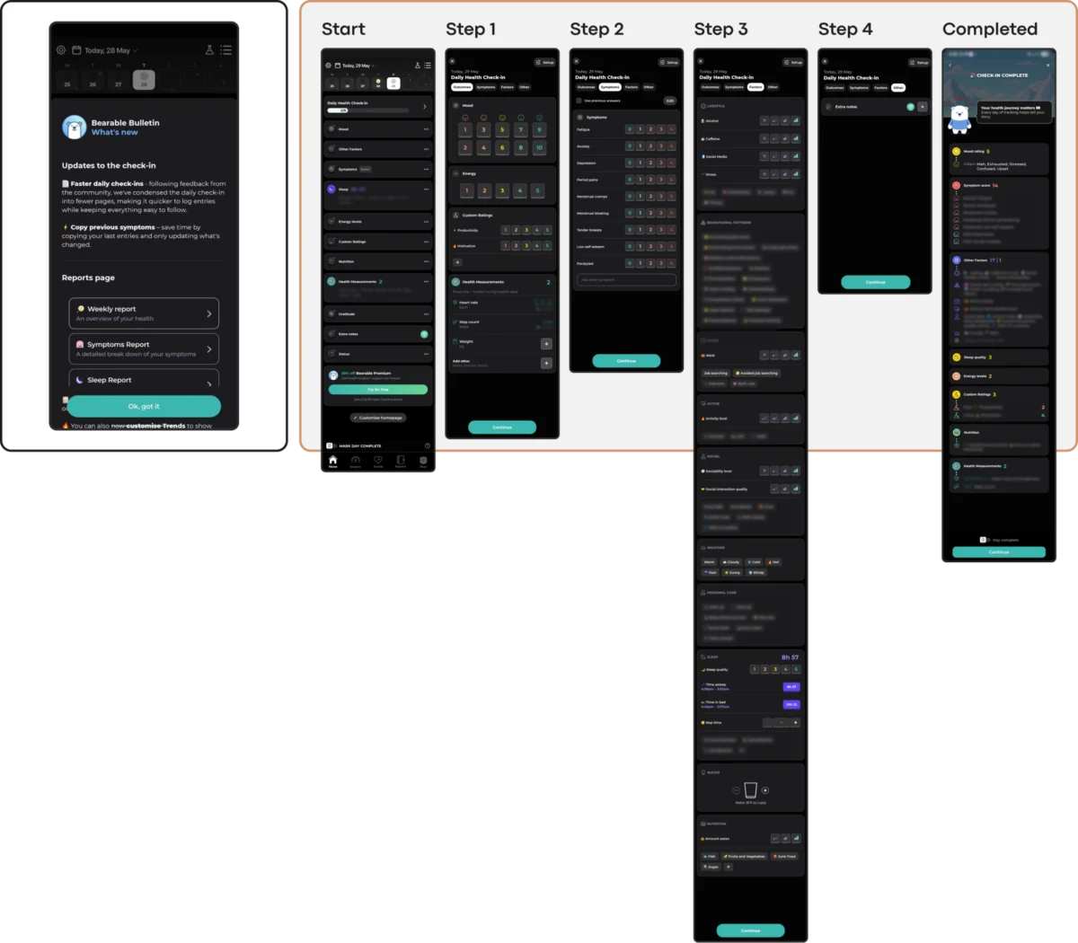
Linear flows and streamlined architectures demonstrate how design can successfully lower the barrier to entry. Applications that guide users through straightforward sequences of small, manageable actions help alleviate the burden of deciding what to do next. Conversely, comprehensive tracking platforms that consolidate nearly every metric—mood, symptoms, sleep, medication, habits, and detailed reports—into a single dashboard can overwhelm exhausted users. While exceptionally valuable for managing chronic conditions or preparing for medical appointments, dense dashboards require an executive capacity that anxiety, depression, and burnout severely diminish.

Emotional Mismatch and the Erosion of Trust
A user’s emotional state dictates the true context in which a mental health application operates, making an empathetic and considerate visual language mandatory. Investigations into how color palettes and aesthetic choices influence mood in mobile health apps reveal a crucial insight: individuals in distress consistently exhibit a strong preference for subtlety. They gravitate toward darker palettes, sophisticated looks, and clean, uncluttered aesthetics. Uncritically cheerful and bright colors, while seemingly supportive on the surface, can create a jarring and physically uncomfortable conflict with a user’s genuine mood.

This does not imply that every wellbeing application must adopt a dark or clinically restrained visual style. The mental health category is broad, encompassing general self-care, anxiety support, habit formation, addiction recovery, trauma processing, and therapy-adjacent tools. A playful style that suits one product may be entirely inappropriate for another. The defining factor is whether the emotional tone aligns directly with the product’s core purpose and the likely psychological state of the user upon arrival.

Emotional mismatch extends beyond aesthetics into core product mechanics. An application featuring a clean, relaxed visual interface can still undermine its own tone if its engagement mechanisms—such as discount wheels or celebratory confetti triggered by logging a difficult, low-mood moment—belong to an entirely different register. For a user recording a painful personal experience, shifting abruptly from quiet support to commercial upsells or celebratory animations creates a discordant emotional mismatch.

Prototyping empathetic spaces through muted, earthy tones and neutral hues set against calming backgrounds helps cultivate a digital refuge. By avoiding bright alerts, sudden animations, and sensory overload, applications can position calmness as their core feature. Trust is established when an interface respectfully aligns with the user’s emotional reality, offering solace through subtlety rather than overwhelming saturation.

The Inconsistency Penalty and Navigational Stability
Mental health management relies heavily on routine, structure, and predictability. However, contemporary UI trends frequently celebrate novelty and disruption, intentionally reimagining fundamental navigation patterns. Introducing novel interaction mechanisms, such as unique swipe behaviors or non-standard button actions, forces users to decode interface mechanics before they can access help, imposing cognitive costs they cannot afford.

While an application can maintain a distinct identity, playfulness, and character, that identity must remain understandable and predictable when a user returns in a depleted state. Gamified self-care tools may excel when users arrive ready to explore and build routines, but encountering non-skippable celebration screens after a grueling day can introduce unnecessary friction. Similarly, massive meditation and wellbeing platforms offering extensive content libraries provide valuable resources for exploration, but during moments of acute stress, users require immediate access to specific support without having to filter through sprawling hierarchies.

Stable information architecture remains vital. Applications that separate learning, symptom tracking, and support into clearly defined, unchanging areas offer the predictability that distressed users require. When novel interaction designs are employed, they work best when they directly serve the exercise itself—such as breathing animations that clearly indicate inhalation and retention intervals—while encouraging users to eventually put the screen down and focus inward.

Accessibility and Non-Coercive Engagement
Exclusionary design choices represent another critical pitfall in modern interface trends. Minimalist low-contrast text alienates users with visual impairments, gesture-only navigation marginalizes individuals with motor difficulties, and visually dense, animated layouts overwhelm those dealing with cognitive or attentional conditions. Because populations requiring mental health support disproportionately experience these accessibility needs, choosing a trending aesthetic over an accessible foundation actively restricts an application’s reach and clinical efficacy.

Furthermore, adopting aggressive engagement mechanics borrowed from entertainment and productivity apps—such as punitive streaks, urgent notifications, and high-pressure gamification—can backfire significantly. While designed to maximize retention, these features frequently transform into sources of performance pressure and guilt within a mental health context. For an individual managing depression, a broken streak or a missed daily goal can exacerbate the exact feelings of failure the application aims to alleviate.

Sustainable retention in mental health technology is earned not by capturing fleeting attention through coercive engagement loops, but by establishing a consistently respectful, reliable, and helpful presence in a user’s life. As global estimates from organizations like the World Health Organization underscore the staggering scale of individuals living with mental health conditions, the digital tools designed to support them must discard portfolio-driven trends in favor of contextual empathy, accessibility, and unwavering usability.