

When users encounter an expandable menu item or an accordion component on a website, the visual cues provided by the interface dictate their immediate actions and expectations. Recent user experience research from the Nielsen Norman Group (NN/g) takes a closer look at these micro-interactions, examining how different visual indicators—such as carets, chevrons, arrows, and plus-minus signs—shape user behavior. The findings highlight persistent design pitfalls, warning against the dangers of split menus and mismatched interactive targets, while pointing to the simple caret as the most reliable signifier in modern web design.
The core question facing interface designers has long centered on reliability: what icon most effectively communicates that a section will expand or collapse upon interaction? While minor stylistic debates often focus on the geometric nuances of triangles, arrows, and chevrons, behavioral data reveals more profound implications for usability. Beyond icon selection, the research underscores why split menus—where an icon performs one action while a text label performs another—frequently frustrate users, and why adhering to foundational design principles yields smoother digital experiences.
The Expectations of Presence and Absence
The baseline findings of the research confirm intuitive assumptions regarding the absence of visual indicators. When a menu item or list entry features no icon whatsoever, users overwhelmingly anticipate that tapping or clicking the element will navigate them directly to a brand-new page. Without a clear signifier of collapsible content, the default mental model for web users dictates direct page transition.
Furthermore, users frequently struggle with custom or overly stylized icons because these bespoke graphical elements fail to establish an immediate, universal convention for expansion. Usability studies tracking user interaction patterns demonstrate that people tend to click or tap fairly equally across both the text label and the accompanying icon for the vast majority of standard UI symbols. This distribution of touch targets means that an icon choice does not merely serve as a decorative or visual signal; it fundamentally dictates the behavior of the entire interactive hit area.

Many digital interfaces attempt to overcomplicate navigation patterns by introducing dynamic, multi-directional arrows that shift orientations depending on the current state of the accordion. Yet, standard interaction design rarely requires an arrow or directional pointer merely to denote a link to a broader category page. The time-tested rule of thumb remains straightforward: if an element functions as a standard hyperlink, the cleanest, most effective method is to simply underline the text. Free of extraneous carets, arrows, or decorative graphics, underlined text clearly communicates navigational intent and functions reliably across diverse user demographics.
Confusing Behaviors with Arrows and Split Buttons
Navigational ambiguity often arises from the implementation of directional arrows. Historically, a right-facing arrow does not inherently trigger an expectation of immediate page navigation, while a downward-facing arrow does not automatically signal that an accordion component will expand upon activation.
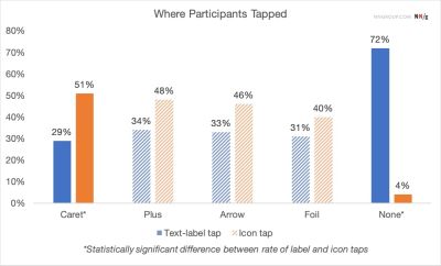
This ambiguity fuels broader usability issues, particularly regarding split buttons. In a split-button accordion pattern, the text label typically routes the user to a separate URL, while the adjacent icon controls the expansion or collapse of the nested menu. Usability testing consistently shows that this split functionality is harmful, frequently resulting in user error and frustration as visitors accidentally trigger page loads when attempting to open a menu, or vice versa.
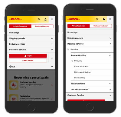
A more reliable architectural approach involves structuring main category items to exclusively toggle the visibility of the nested menu upon activation. To provide access to the top-level category page itself, designers can integrate a dedicated "Overview" link directly inside the expanded menu panel. Real-world implementations, such as those found on major logistics and e-commerce platforms like DHL, demonstrate the effectiveness of this pattern. By eliminating unnecessary arrows and discarding split menus in favor of dedicated overview links within the dropdown, these interfaces streamline user journeys and reduce accidental misclicks.

The Ambiguity of Plus-Minus Signs and Directional Arrows
While universally recognized, plus and minus symbols, alongside vertical directional arrows, carry inherent risks stemming from semantic overload. In digital product design, a plus sign (+) is deployed across countless contexts, ranging from adding an item to a shopping cart and zooming into an image to saving content for later or expanding a section. This semantic multiplicity makes the plus sign particularly confusing when applied to complex, multi-level navigation systems where multiple hierarchical tiers might be expanded simultaneously.
Similarly, vertical arrows can imply scrolling actions, page sliding, the discovery of next-match search results, or immediate jumps to specific anchor points within a long-form document. Although plus-minus icons and directional arrows are generally understood by web users, their heavy semantic burden frequently leads to misinterpretation depending on the surrounding layout. Because these symbols are overloaded with multiple meanings, relying on them exclusively can introduce cognitive friction.
Establishing Reliable Navigation Patterns
Synthesizing usability data across multiple studies points to a clear industry standard: the safest, most predictable choice for accordion components is the downward-facing caret or triangle by default. Upon user interaction, this icon transitions smoothly to point upward or sideways, visually reinforcing the updated state of the component. When design constraints require an alternative, standard plus-minus indicators generally perform well, provided they are implemented with clear contextual boundaries.
Ultimately, modern digital interfaces benefit from restraint. Designers do not need extraneous icons or directional arrows to clarify the destinations of standard hyperlinks. Similarly, avoiding error-prone split menus ensures that dropdowns and navigational components perform singular, predictable functions—either revealing nested options for exploration or routing users directly to a designated page via explicitly underlined text titles. In interface design, clarity and simplicity consistently outperform unnecessary complexity.