

Despite achieving broad browser support that now covers approximately 94% of the global web landscape, CSS container queries remain surprisingly underused and frequently misunderstood across the frontend development community. While the feature has steadily matured since its initial release, recent developer surveys and industry insights suggest that a significant disconnect persists between developers’ awareness of the technology and their actual implementation of it in production environments. Examining how container queries differ fundamentally from traditional media queries reveals why treating them as interchangeable tools leads to common layout failures, and how they ultimately enable reusable components to respond naturally to the specific contexts in which they appear.
When CSS container queries first arrived on the scene, many developers experienced a familiar moment of hesitation. Knowing what developers know now about the evolution of responsive design, it is easy to look back with hindsight, yet that initial skepticism was widespread. The primary question that naturally arose for many practitioners upon encountering the syntax was a simple one: why exactly do we need a new layout mechanism when media queries already exist and have successfully powered responsive web design for well over a decade?
That initial reaction is validated by data from recent industry metrics. According to the State of CSS survey, an overwhelming 86% of developers are aware of container queries, yet only 41.4% actually use them in their daily work. Industry figures, including frontend educator Kevin Powell during his talk at SmashingConf Amsterdam, have pointedly highlighted that container query adoption has been remarkably poor. This trend presents a compelling paradox, given that the ability for individual components to adapt dynamically to the size of their outer container had sat atop numerous CSS feature wishlists for years prior to its implementation.
The core issue does not necessarily stem from a lack of interest in the feature, but rather from how developers are approaching its implementation. Many early attempts at utilizing container queries reveal a fundamental misunderstanding rooted in visual familiarity. At first glance, container queries look remarkably similar to traditional media queries. Because they share a comparable syntactic structure, it is easy for developers to assume that they serve identical purposes and function under the same underlying assumptions. In reality, they do not.
To understand why this distinction matters, one must examine how traditional media queries operate. The viewport has always served as a proxy for environment detection. When developers write a standard media query, they are fundamentally asking the browser a single question regarding the dimensions of the current screen. Media queries answer this inquiry effectively, but they remain completely blind to the actual space allocated to a specific component. For instance, if a card component is placed inside a grid cell that is restricted to a narrow width on a large desktop monitor, the media query still evaluates the massive width of the entire viewport. Consequently, the query fires and applies styles designed for spacious viewports, even though the component itself has barely any room to breathe, leading to cramped layouts, text overflows, and distorted interfaces.
Container queries, by contrast, look inward rather than outward. Instead of asking how wide the browser window is, a container query asks how much space is available for a specific component in its current position right at that moment. By registering a parent wrapper as a container and querying its inline size, components can dynamically alter their internal layouts based strictly on their immediate surroundings. This shifts the paradigm of responsive design away from rigid viewport thresholds and toward content-driven, context-aware styling.
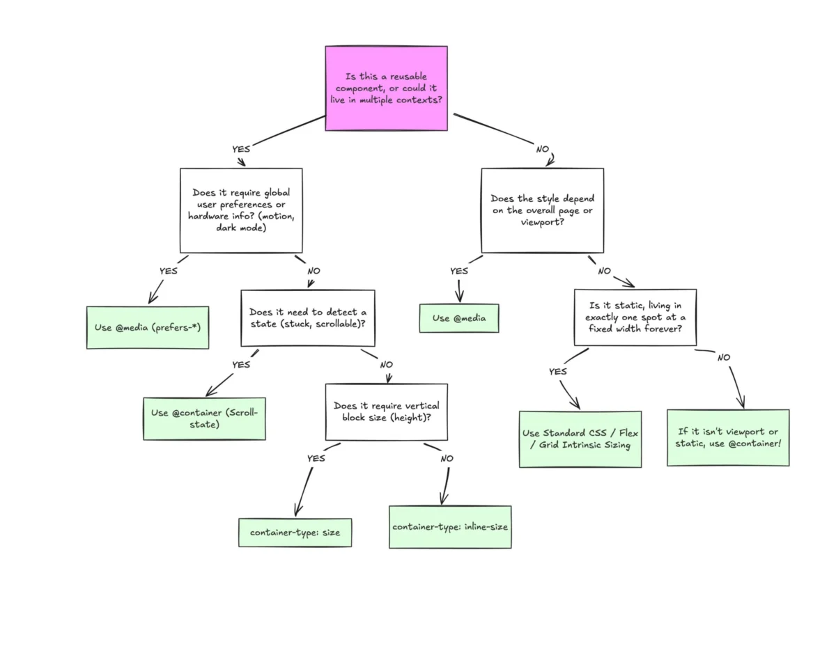
A helpful way to distinguish between these two mechanisms is to categorize them by layout type, separating macro layouts from micro layouts. Media queries are ideally suited for macro layouts, dealing with the overarching structure of an entire page. This includes major structural components like headers that span the window, footers, main grid layouts, system preferences such as dark mode, and device capabilities like touch input. These macro concerns are genuinely true for the entire page structure.
Container queries, meanwhile, are designed for micro layouts—the myriad components that live inside that macro structure. Developers reach for them when content needs to responsively fit whatever space it is allocated, regardless of whether that space resides on a mobile phone screen or squeezed into a narrow desktop sidebar. This shift encourages thinking in terms of page layout versus component layout. In an era where the modern web features thousands of unique viewport sizes, relying entirely on the browser window to dictate component states becomes increasingly impractical.

Beyond structural layout adjustments, container queries also introduce specialized units—such as cqi and cqw—that unlock new possibilities for fluid typography within components. Traditionally, developers relied on viewport-relative units inside media queries to scale font sizes dynamically. While effective at the page level, this approach breaks down when a component is relocated to a sidebar where the viewport dimensions are completely irrelevant, causing the typography to scale improperly. By pairing container query units with CSS clamp functions, developers can create fluid typography that scales strictly in relation to the component’s specific container, keeping the entire code self-contained and context-aware.
Furthermore, container queries offer unique capabilities in detecting internal layout states, such as flexbox wrapping, which media queries cannot achieve. Because media queries only observe the external browser window, they are structurally blind to internal layout events like flex items wrapping onto a new line. By nesting container queries inside flex items, developers can establish clever workarounds that apply specific styling rules the moment a component wraps, all without having to resort to JavaScript-based resize observers.
Despite their power, container queries do introduce certain side effects and technical caveats that developers must navigate. Unlike media queries, which can be applied globally to any element relative to the viewport, container queries require a strict structural relationship. A container cannot query itself; attempting to do so would result in an infinite calculation loop. Consequently, developers must introduce an explicit wrapper element to serve as the container before styling its descendants.
Additionally, querying a container’s full size, including its block or vertical dimensions, can inadvertently cause layout collapses if an explicit height, minimum height, or aspect ratio is not defined, because the browser calculates the container’s dimensions without initially factoring in its children. For this reason, developers frequently rely on inline-size queries to avoid unexpected layout shifts. Another limitation is that container queries cannot currently accept custom property values as breakpoints, as CSS variables cascade dynamically and could otherwise introduce cyclical evaluation conflicts.

Ultimately, container queries are not meant to entirely replace media queries, but rather to complement them through a clear separation of concerns. Media queries retain their vital role in governing page-level, macro responsive behavior tied directly to the viewport, while container queries handle the micro-level adaptation of reusable components shifting across diverse spatial contexts. Recognizing this distinction helps bridge the adoption gap, allowing developers to leverage the full power of modern CSS to build genuinely resilient, context-aware user interfaces.